Downtown Kitchener BIA

PROJECT TYPE

Logo Design
Branding
Newsletter Design
Website Reskinning

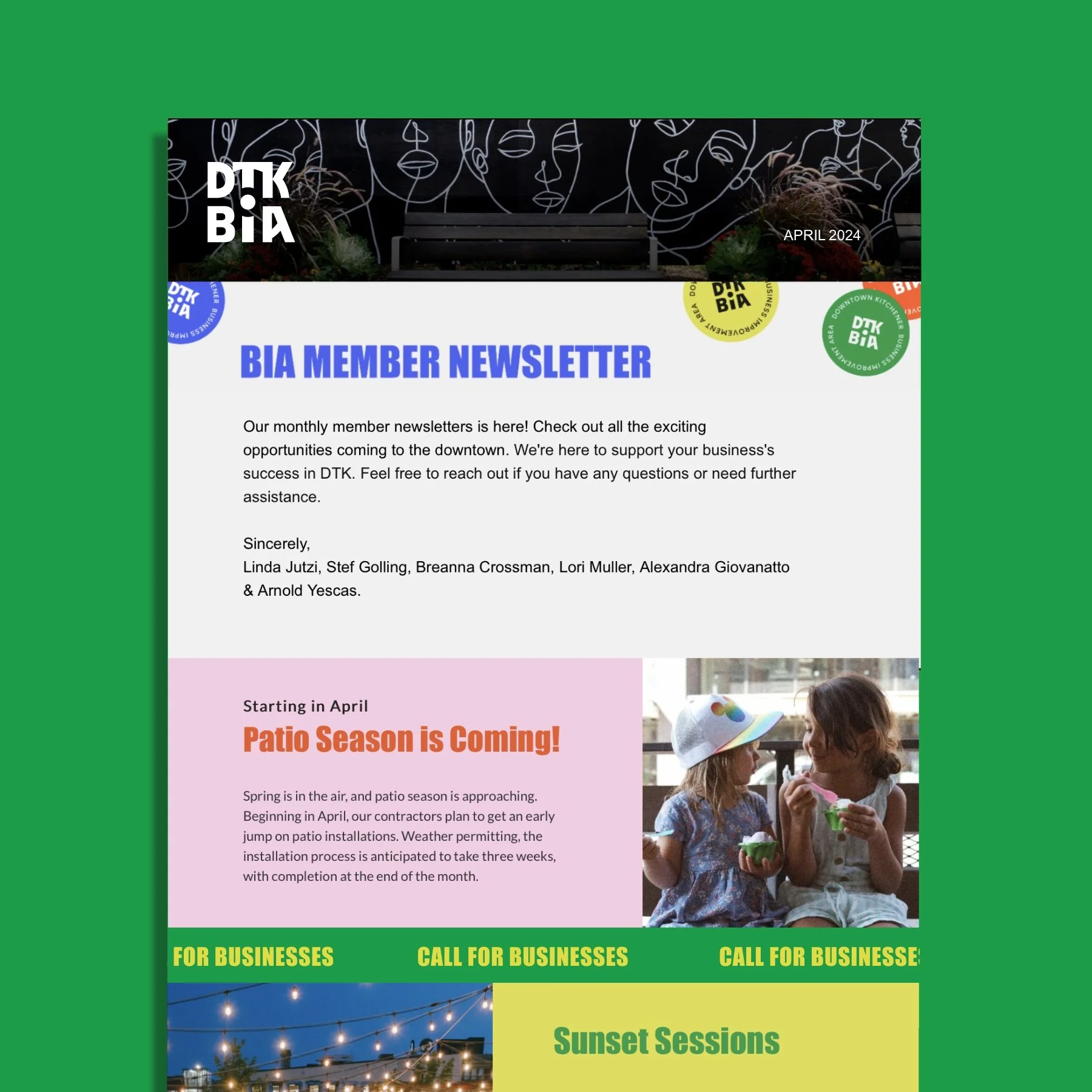
The Downtown Kitchener Business Improvement Area (BIA) sought a brand refresh that would be impactful, memorable, and enduring. Emphasizing the Downtown Kitchener BIA's initiatives and shining a spotlight on the diverse businesses and individuals within the Downtown core was a top priority.

Created while working at Him&Her | Art Direction: Andrew Mcnamara

Downtown Kitchener BIA logo grid line construction
A graphic that shows the Kitchener BIA logo meaning. It show the centre i in BIA expanded to show that the BIA represents the people at the centre of it all
A image that shows how the logo can be treated as a graphic element
A outdoor tent at the Downtown Kitchener BIA event
A mockup scattered colourful business cards
A grid of pages from the BIA brand guidlines
A mockup of the BIA logo with a smile face replacing the dot on the i in BIA
A mockup of a newsletter template that was created for the BIA
A mockup of the DTK BIA website landing page
A stationary set including a letter head and business card for BIA
Previous
Previous

Holly's Cafe

Next
Next

Grassbox